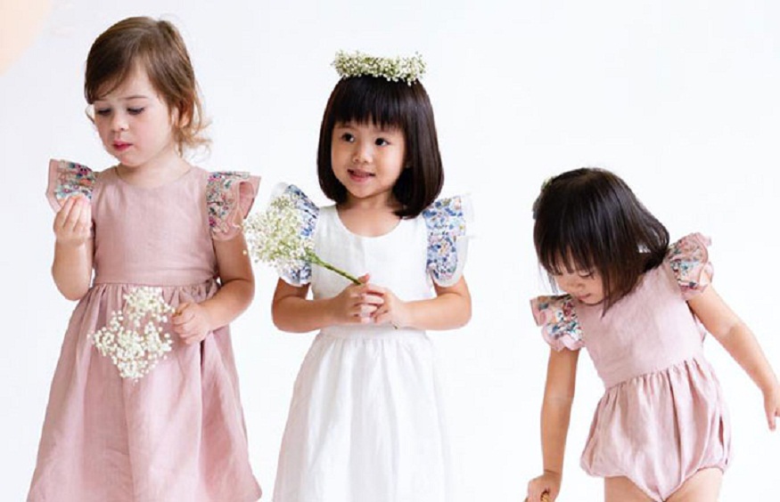
Event backdrop is a picture that is used during the event as a summary or summary of the event and is chosen by the organizers to represent the event.
It has a number of qualities that are thought to be representative of the spirit that will be shown at the event, and these qualities should appeal to the audience.
Since the backdrop is supposed to represent both the event and the brand or brands that are paying for it, it should be interesting to look at and easy to remember.
Today, we’ll take a closer look at how this marketing tool, which has been around for a while, actually works.
Considerations when designing an event backdrop
Consistency
The theme of the background should match the theme of your booth design, your brand, the nature of the event, and the point you are trying to make.
Keeping your ideas in line helps you make your point, and doing so will make a stronger impression. The layout, colors, logos, fonts, and styles of writing should all be the same.
Backdrop Size
The banner should be at least 8 feet high so that no one can see over it.
The breadth, on the other hand, changes depending on how many people are expected to be in front of it at any given time.
If there are too many people in the photo and they are spread out beyond the edges of the background, they will cover it up and make the photo look messy.
The Logo Format
Their typeface should be big, simple, and easy to read, and it should be done in a high-quality way.
If you don’t, you won’t be able to tell what they are from the pictures, and they might just look like smudges.
This goes against the point of having a photo booth in the first place, which was to spread the word about the brand.
The Size of the Booth
It is important that the size of the booth setup be taken into account in the design. For the booth to look good and have more of an impact, it should be symmetrical and proportional.
Backdrop Material
Matte is the best finish for a backdrop material because it doesn’t reflect too much light.
Glare is a problem for photographers because it is caused by shiny, bright materials that reflect light.
Photos that aren’t very good don’t show how the event backdrop is meant to make people feel like a community.
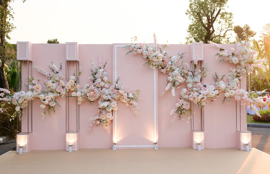
Backdrop Color
The color of the background should help the logo stand out against the color of the foreground.
If you want the colors of your company to be seen, it is in your best interest to use a backdrop with a color that contrasts with the theme you have chosen.
Off-white colors are better than bright white ones because bright white colors tend to reflect the light from the camera, which can make images look bad.
Number of Logos
When there are too many sponsors, there should be a limit on how many logos can be shown on the background.
If there are more than, say, five sponsors, and they all show up on the backdrop, it will be hard to achieve brand dominance. The mess would make it impossible to reach this goal.
The people who are paying for the event need to agree on a few people who show the spirit of the event.
Copywriting
Decide if you want to include text in the design of your backdrop or not. If this is the case, you should try to come up with content that will appeal to the people who stop by your booth, get them to do something, and make them feel loyal to your business.
After thinking about all of these things, it looks like your idea is finally ready to be tested. The idea doesn’t come with a manual, but it will be related to a campaign you are already running or are about to start, as well as an event you are going to.
It will help your campaign in a number of ways, like getting the market interested in your event, and it will give you access to channels you may not have had before.
Types of Event Backdrops
Fabric Backdrops
They are used for low-key events where photography is the main focus.
Most of the time, they don’t have a message on them because they don’t tell people what to do.
Most of the time, you’ll find them in photo booths, where they are used with backdrop stands.
Printed Backdrops
In this group are the vast majority of the companies that are currently using the event backdrop as a way to promote their business.
The designs need to be printed out and put on paper before they can be used as backdrops. Since they come with the company’s colors and logos, these brands aren’t exactly a closely guarded secret. They are always moving forward with their goals.
Neon Backdrops
They are fairly new to the business, and their design includes neon lights. There is no need to print because the neon lights can be bent into any shape without any extra work.
They add their own light to the photos, which helps them become good photographers.
LED (Light Emitting Diode) Backdrops
They are the most interesting and fun to take part in. The display isn’t always there, and it’s always being changed to reflect what’s happening on stage.
They are sometimes tuned so that they move along with the beat of the music being played on stage.
The background of the event should be carefully thought out because it sets the tone for all of the promotions, product launches, and other events.
When it comes to the way it looks, you shouldn’t be limited in how creative you can be. Every event has its own plan, and the forces behind it are almost never the same.
How to make your event backdrop appealing
Step-and-repeat banners, also known as backgrounds with a pattern that repeats itself across the whole width of the banner, are great tools for branding that can be used at any event as long as the following rules are followed:
Banner Size
When deciding what size banner to order, it helps to know how many people will want their picture taken in front of the banner and how big the crowd is likely to be.
A backdrop’s size is usually between 8 feet by 4 feet and 8 feet by 12 feet. If the size was misjudged, photos could be taken where people can be seen beyond the banner. This could give the impression that the event wasn’t well planned.
Logo Format
Even though the corporate logo and the logos of any sponsors are probably already in place, a new logo design may be needed for private events like family get-togethers or birthday parties.
When making a logo, the font should be large and easy to read from a long way away. This will make sure that the writing can be read when the logo is photographed.
In that case, the background will look like a piece of fabric with smudges of different patterns on it.
On-Brand Design
It’s important that the style of the backdrop matches the organization that will be hosting the event.
For example, a company known for using bright colors shouldn’t have a black-and-white background.
Also, the design could be dynamic, making use of the ways that graphic design can be used instead of just putting a logo on a simple banner. This is better than the other choice.
Limit Logos
Although the event’s sponsors should be acknowledged in some way, the number of logos that are displayed on the background should be kept to a minimum.
No matter what the trend is, having too many different logos might make the design look cluttered.
A good number of logos to use is between four and five, because this keeps the step-and-repeat pattern from really repeating itself.
Balance
When making different parts of a backdrop, the idea of balance should be kept in mind.
While deciding the size of the logo, you should try to find a happy medium so that the background is neither either too little to be visible or too large that it distracts from the individuals who are posing in front of it.
In addition to this, you need to provide adequate space between the logos to prevent them from running into one another.
Also, you should try to make sure that the logo is laid out in a way that is balanced.
Possibly you would like a design in which one of the logos is larger than the others, or you might decide that staggered step and repeat patterns are more appealing to look at than columns that are aligned in a straight line.
High Resolution Logo
When you upload the file with the logo to the design template, the file needs to have a high resolution. This will make sure that the final product doesn’t look like it has a lot of pixels or is fuzzy.
Before sending the design to be printed, the background design as a whole should
Color Coordination
In the same way that you should use colors that go with the event brand, you should also think about the whole color scheme.
Even if a certain company’s brand is linked to a certain color scheme, it might not be the best idea to use that color scheme to make an interesting background.
There’s a chance that a color you chose for the logo at first will work better as the background, and vice versa.
Banner Material
The best results come from printing backdrops on matte paper. Glossy materials can cause glare when they are in certain lighting conditions, which goes against the point of advertising logos.
Vinyl is another material that can be used as a backdrop, but like the others, it might cause glare.
Banner Background
Glare is something else you’ll need to think about when choosing the color for your banner’s background.
Off-white tones are often used as background colors because they don’t reflect as much light as pure white colors.
The darker the color, the better it absorbs light and cuts down on reflections, both of which can ruin an image.
You should also make sure that the background of your banner is not too distracting and doesn’t take away from the logos in the foreground and center of the banner.
No matter what color you choose, make sure that the background you choose makes your logos look better and helps them stand out.
Backdrops are great additions to any event because not only do they give a good place for advertising, but they also make a beautiful background for photos taken at the event.
To make the best impression on the people who come to your event and on people who might see it on social media, the design needs to be consistent with the brand and also look good.
Keep these tips in mind as you work on your design so you don’t make any dumb design mistakes down the road.